Northbeam Labs
Developer launch page plus an 'Ask the docs' RAG assistant with citations and a content-gap loop.
Northbeam is a concept launch campaign — a single page receiving cold paid traffic, where every element either advances the decision or is removed.
- AI pattern
- RAG knowledge assistant
- AI component
- Docs assistant
- Typical timeline
- ~5 weeks
- Maps to
- Website Starter + AI Website Assistant
Northbeam Labs is a fictional company — this is the build plan we execute for a business like it.
Try it live
Use it, don't just read about it.
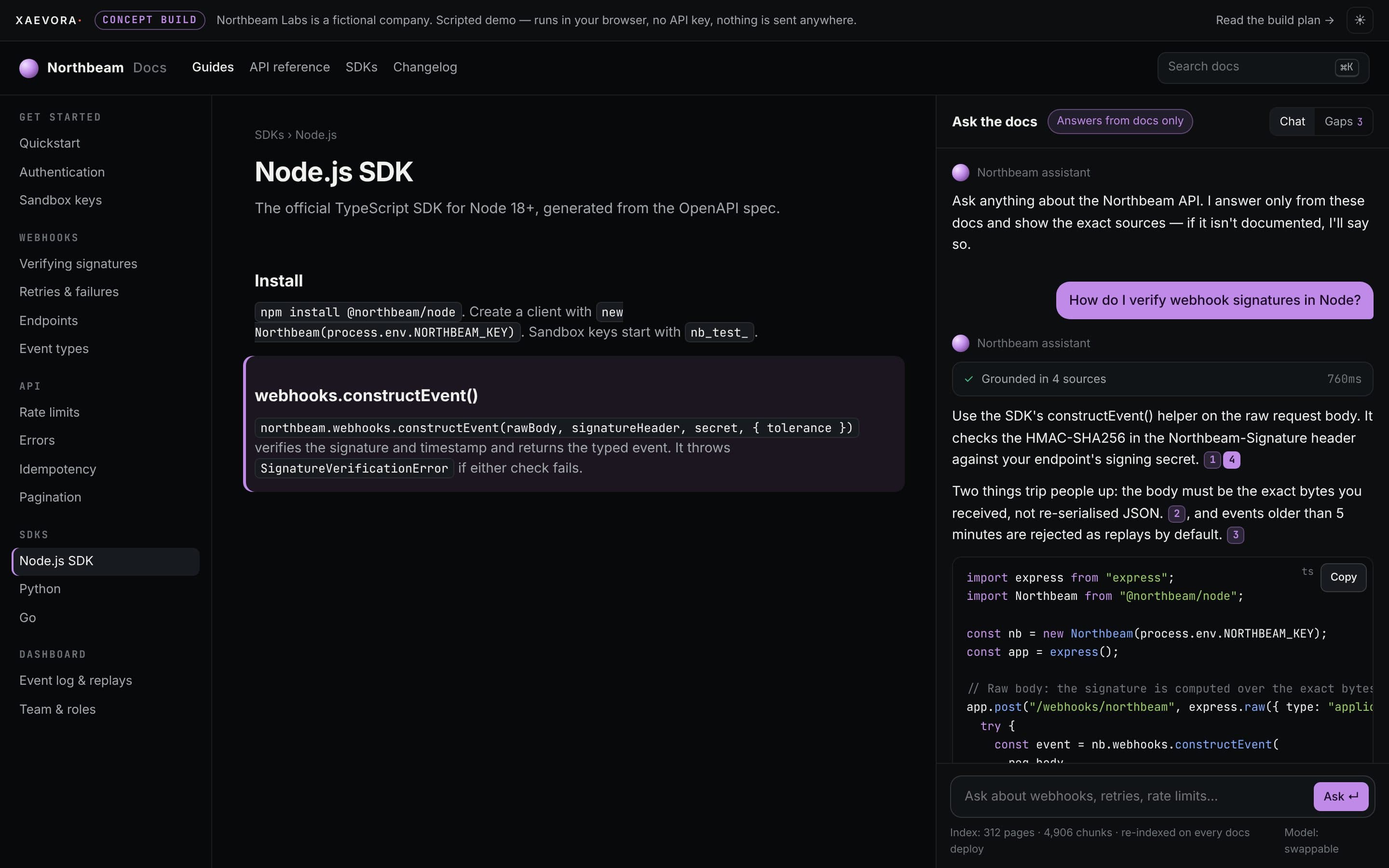
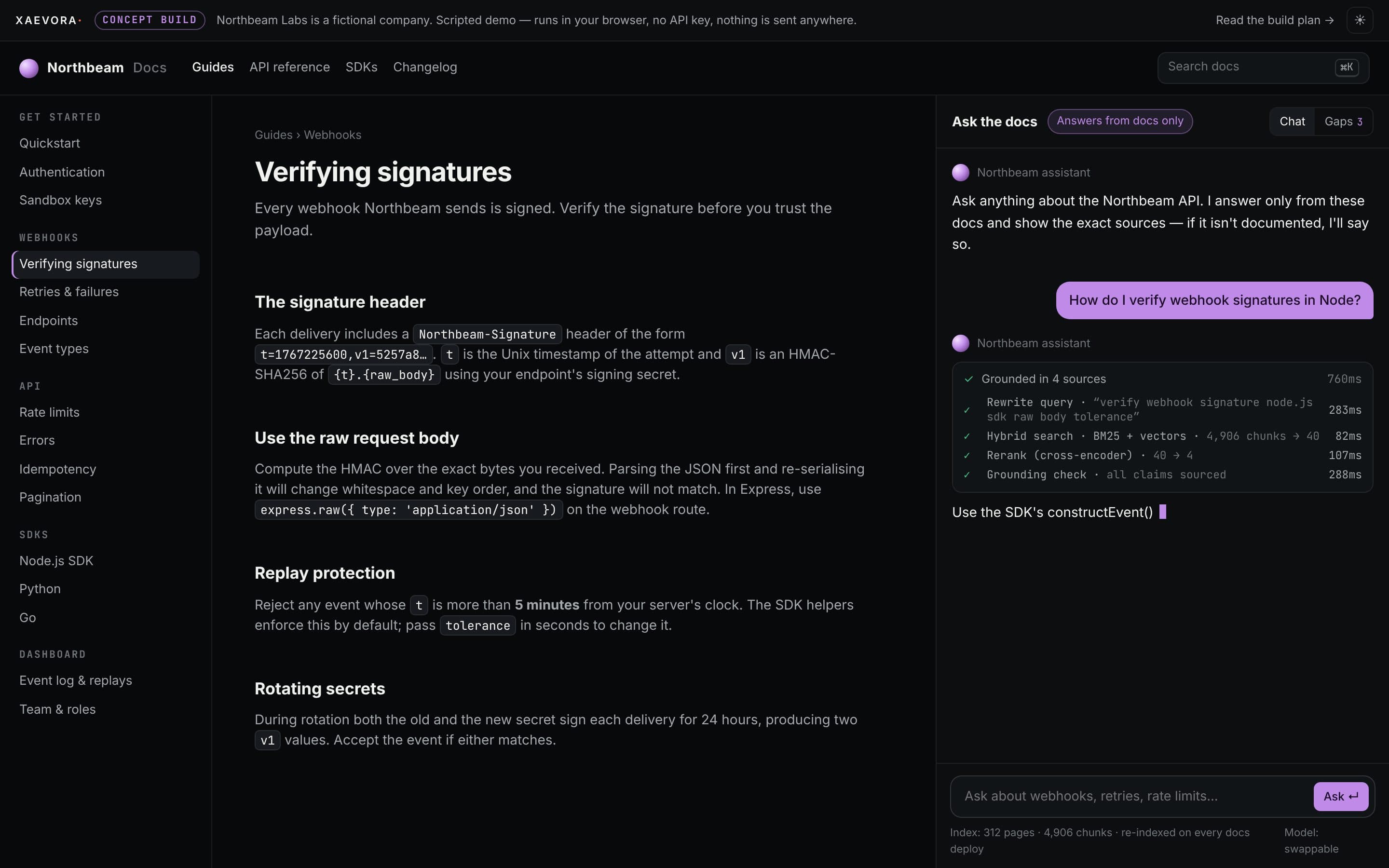
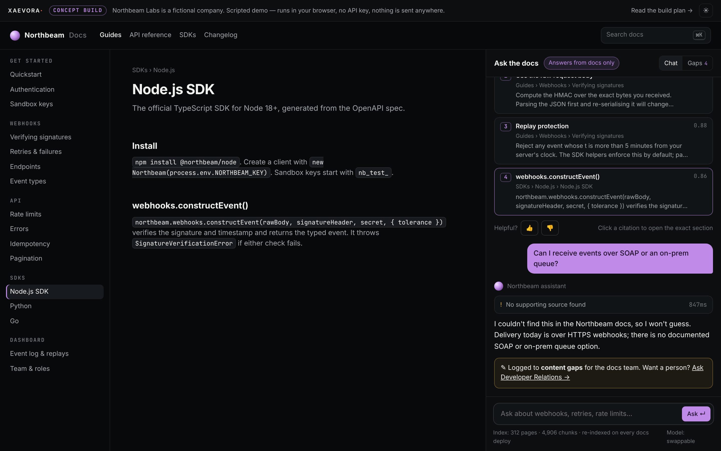
Ask the docs and get a streamed answer with runnable code, inline citations and the retrieval trace — and an honest 'not in the docs' that feeds a gap report.
- 01Ask how to verify webhook signatures
- 02Click a citation to jump to the exact section
- 03Open the retrieval trace
- 04Ask something undocumented and check the Gaps tab
Scripted and deterministic so it runs anywhere. In production the same interface runs on live models, your data and your systems.
01The problem
What's really in the way.
Cold traffic arrives sceptical and leaves fast. A launch page has roughly one scroll to establish what the thing is, why it is credible and what happens next.
- 01
No existing brand recognition to borrow credibility from.
- 02
Traffic arriving from several ad variants, each making a slightly different promise.
- 03
Mostly mobile, often on poor connections, where a heavy page is simply an abandoned one.
02What we'd build
The scope, plainly.
A fast launch page for a developer tool, and a documentation assistant that answers integration questions with code examples and links to the exact docs section, and logs what it could not answer.
Launch page
One argument, one action, objection-ordered sections and a sub-second load budget on mobile.
Ask the docs
Answers from the docs and API reference only, returns runnable snippets and links each answer to its source.
Content gap report
Questions the assistant could not answer are grouped weekly, so the docs team knows what to write next.
Attribution
UTM capture on entry, carried through to the sign-up record, so campaign spend can be compared honestly.
03Architecture
How the pieces fit.
Models are the swappable part. The tools, rules, logging and tests around them are what make a system dependable.
- VisitorL1
- Launch page (static)
- Docs site
- Assistant panel
- AssistantL2
- Hybrid search: BM25 + embeddings
- Cross-encoder rerank
- Inline citations on every claim
- IntegrationsL3
- Sign-up / waitlist API
- Analytics events
- OperationsL4
- Unanswered-questions report
- Re-index on docs deploy
- Next.js
- TypeScript
- OpenAI / Anthropic models
- pgvector or Pinecone
- Hybrid search + rerank
- Eval suite (RAG metrics)
- Vercel AI SDK
- Vercel
04Screens
The interface, working.
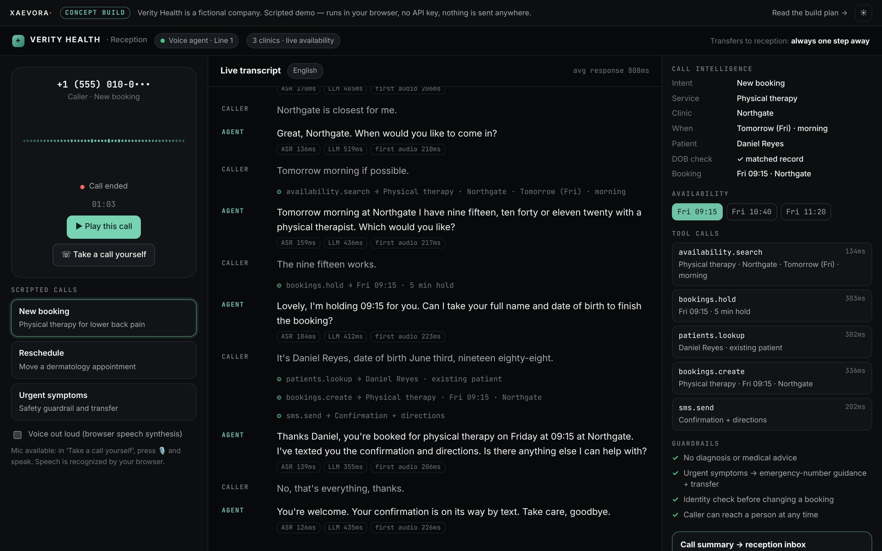
Captured from the live demo in a headless browser — not mockups.
05Deliverables
What you'd own at the end.
- Launch landing page with variant-ready blocks
- Docs assistant embedded in the docs site
- Automatic re-index when docs are deployed
- Weekly content-gap report
- UTM attribution on sign-ups
- Handover and documentation
06Typical timeline
Shipped in ~5 weeks.
- Message & structureObjection order, page outline
- Launch page buildDesign, build, performance budget
- Docs indexingChunking, retrieval, citations
- Assistant & testsQuestion set, refusal rules
- Launch & handoverMonitoring, gap report
Schedule fixed in writing at kickoff.
07Approach
Decisions we'd take first.
Strategy
Order the page by objection rather than by feature. Each section answers the question the previous section creates.
- Continue the adThe headline picks up the exact promise of the creative, so the click feels like one continuous thought.
- Objection sequencingSections mapped to the real order of doubt: what is it, does it work, is it for me, what does it cost, what now.
- One exitNo navigation, no footer maze. A persistent action that follows the visitor down the page.
Design
High contrast and unusually direct, with a deliberate change of rhythm every few sections so a long scroll never feels like one.
- Rhythm changesFull-bleed, then narrow measure, then a dense comparison block — pacing keeps attention without gimmicks.
- Mobile composed firstDesigned at 390px and expanded outward, because that is where the traffic actually lands.
- One accent, used onceThe accent colour appears on the action and nowhere else, so it never has to compete with itself.
Engineering
A performance budget set before design: under one second to largest contentful paint on a 4G connection, and no layout shift at any breakpoint.
- Critical path onlyAbove-the-fold rendering depends on no JavaScript at all.
- Attribution on every leadUTM parameters captured on entry, persisted across the session and attached to the submission record.
- Variant-ready structureHeadline, proof and offer blocks are configuration, so a new test variant is a data change.
08Intent
What it's designed to do.
Success criteria are agreed and measured from launch.
- Get a developer from landing to first API call with fewer detours.
- Answer integration questions from the docs, not from the model's memory.
- Turn unanswered questions into a docs to-do list.
- Keep the page fast enough for paid mobile traffic.
Your project
Want a plan like this for your business?
Book a 30-minute call. If it's a fit, we'll send a written scope and fixed price, or suggest starting with a $500 pilot.
Or email hello@xaevora.com · reply within one working day